
The November revision of the Mumbai Auto-rickshaw Fare card for 2012
The previous version of the fare card has seen over 13,562 downloads since I put it up in April (this is just counting the PDF file of the Mumbai version, the JPEG of the same saw 6,415 downloads, the Thane PDF and JPEG saw 2,301 and 1.364 downloads respectively, before I unlinked the files). This...

The revised Mumbai Auto-rickshaw Fare card for 2012
11th October 2012: I’m currently updating these cards, so please hang on till I put them up here. I’ve taken the download links off for now to avoid any confusion. Updated version here. Update (30th April 2012): The different versions of the tariff cards have seen well over 200 1000 downloads since I released...
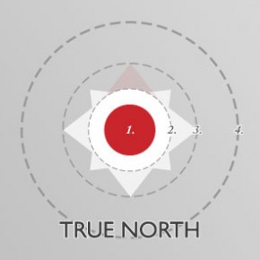
True North: Proportioning the logo
I remember a professor quoting the architect Tadao Ando once during a lecture about making architectural drawings during the early part of my graduate studies. I’ve looked high and low for the exact quote, because I don’t remember it verbatim. However, the basic jist of it is that every line an architect (or designer) draws...
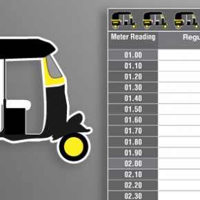
The Mumbai Auto-rickshaw Fare card
Update: I’ve released the updated version of this for 2012 here. I’ve been noticing continued downloads of the old fare cards over the past few days, even after the new release. Please use only the updated version, you’d probably end up in a fist fight with your rickshaw driver if you use the outdated ones...
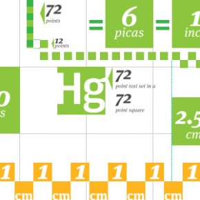
The relativity of units
What units do you measure with? Architects are trained to make their scaled drawings in metric units; when they graduate and go out to work in firms or as apprentices, many discover the old British unit system still in practice. Some of us who’ve jumped disciplines to graphic design are then introduced to point sizes...
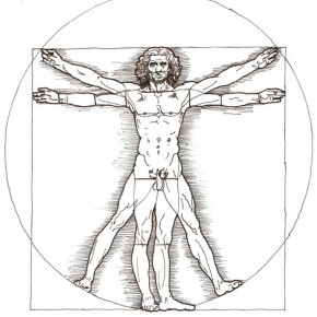
Vitruvian Man
The original illustration of da Vinci’s Vitruvian Man lies in the Gallerie dell’Accademia in Venice. It is drawn on a sheet of paper of a size similar to a standard A4 paper. The drawing is practically etched into the paper with (I assume) a bow pen. Tiny details and flaws, like smudged ink at the...

Crafting a symbol: True North
Sometime towards the end of last year, I started work on an identity design project for True North Learning Systems. True North are Rohit Mohindra, Jogesh Motwani and Raj Arora, who at that point were looking to set up a training centre for students preparing for their SATs and other tests and exams through an...
The Design Manifesto
This is the first of a set of three manifestos I’m writing which I hope will form the seed, soul and eventually the spine of what this site eventually hopes to be. This is something I have been putting off for a while now, not out of procrastination, but rather from not having found the...

