 I remember a professor quoting the architect Tadao Ando once during a lecture about making architectural drawings during the early part of my graduate studies. I’ve looked high and low for the exact quote, because I don’t remember it verbatim. However, the basic jist of it is that every line an architect (or designer) draws must have meaning or reason behind it.
The lines one draws as a graphic designer rarely translate into tangible objects and spaces, but extending the philosophy of drawing, or constructing with meaning always seems to create a more satisfying end product.
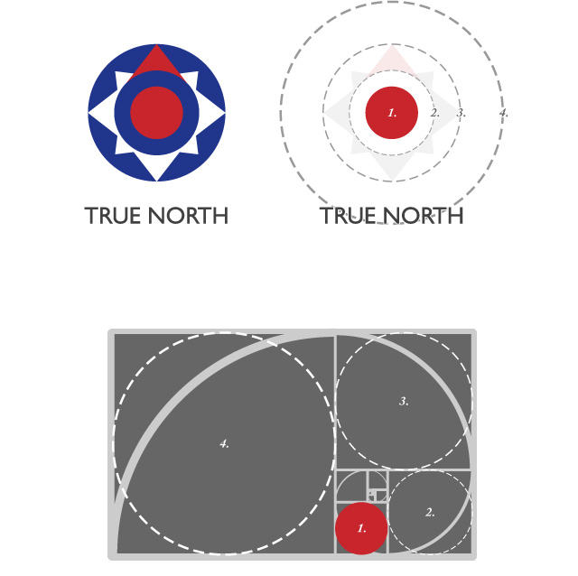
I used a proportioning system based on the Golden Section while designing the logo for True North. The Golden Section is a proportion we see and experience every single day. It is the proportion of the distance from our feet to the navel to the top of the head and approximately measures up to 1:1.618. The Golden Section is famously represented in the nautilus shell curve drawing which is formed by drawing squares in a 1, 2 (1+1), 3 (1+2), 5 (2+3), 8 (3+5), 13 (5+8) and so on. This is the Fibonacci sequence and the geometric representation of it (illustrated above with the curve) approximately represents the Golden Spiral. The Fibonacci sequence is a progression that is found in nature in the way leaves sprout on a stem of a plant to the unfurling of the florets of a sunflower to animal reproduction.
In this particular case, every consecutive circle shares the relationship of a common proportion of 1:1.618 (which also allows each circle to inscribe itself into consecutive squares of the Golden Curve. The position of the baseline of the text also is tangential to the largest circle, 1.618 times the size of the diameter of the circular graphic of the logo.
The Golden Section isn’t the only proportioning system out there; in fact, my second most favourite proportioning system is that of the Islamic grid, or the √2 ratio (which is incidentally the ratio of the side of a square to its diagonal). The Golden Section relates directly with the proportions of most human bodies and elements in nature, which makes it a good starting point for proportioning shapes and elements. It’s also a proportion that the eye tends to naturally find appealing, if used right.


2 comments
Revati says:
Jul 10, 2011
Awesome, I have never been able to make sense of the Golden Section, until now 🙂
Raj says:
Jul 12, 2011
Very interesting. I love the detail Anand
Fibonacci sequence sounds like a method of elimination by the Italian mafia