Sometime towards the end of last year, I started work on an identity design project for True North Learning Systems. True North are Rohit Mohindra, Jogesh Motwani and Raj Arora, who at that point were looking to set up a training centre for students preparing for their SATs and other tests and exams through an enriched learning experience with the aid of top tutors and educationalists.
After the initial discussions about the company, what it stood for and where it planned to be in the near and distant future and an exercise where adjectives, attributes and aims were listed, I embarked upon the first wave of options. The idea behind the adjectives exercise is to find visual clues for a starting point to the design process.
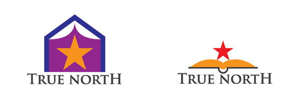 “True North” is a nautical term referring to the direction of the North Pole. Compasses have a little deviation which makes the north indication they show us slightly different from the actual orientation of north (also known as Magnetic North). The Pole Star is the easiest way to find True North, so it was inevitable that it would find its way into the visual language, in the early attempts at least, also thanks to its nature as a guiding star. These first options primarily focussed on the education and learning aspect of the organization.
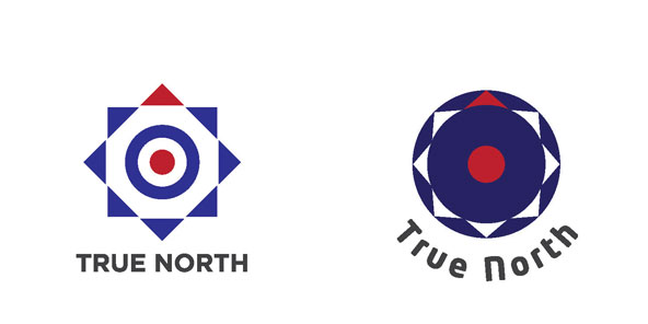
The second group of images primarily focussed on the nautical nature of the word. I chose two prominent colours for the logo, the dot symbolising the target (from the idea of the organisation guiding students to their academic targets) and the upward pointing red triangle denoting an upward growth and movement.
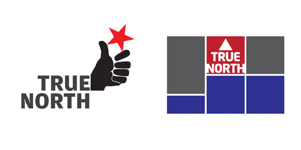 One of the adjectives that came up in the first exercise was “empowerment”, which sort of explains the commie rebellion type logo option (above left) with the fist, striving to achieve its goal, completely confident in doing so. The option on the right meant to symbolise excellence (through a sports podium, with only two positions, first- and everything else).
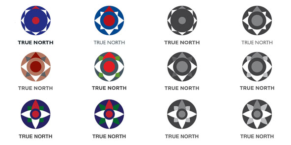 Finally the form selected was the compass-target one and I went about working out form variations to the concept, along with colours.
 Eventually this distilled down to two types of forms and colour combinations.
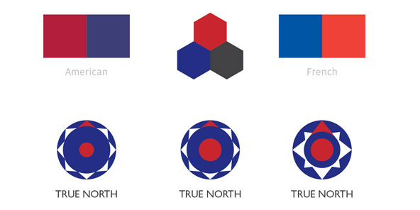 A short while before the final form was selected, an issue came up regarding the red-white-blue colour combination that had been selected as brand colours. The red-white-blue colour combination almost exclusively symbolises all things American, though the same combination also appears on the French flag. I did a little digging to find the exact CMYK and RGB colour values for both flags and made this comparative diagram to demonstrate the subtle difference between the chosen combination and the other two. This is a rather subtle but important issue, as someone looking at the logo might consciously or unconsciously associate the shade of blue and red with the country, whereas a brand, unless consciously linked in its service, aims or origins to a country, should be a free standing entity with no biases or semi-hidden allusions.
 This is the logo that was eventually finalised. One of the important factors that aided this evolution of form was the richness of ideas, terms and adjectives from the very first exercise. Every word and idea can form the basis of a special direction and design approach. In this case this bank of adjectives and visions were complimented by a title that has its own prominent symbolism.
You can check the True North website out here.

